|

Hi all!
Following the 14 designs of the contestants from overseas, here are the features of the remaining designers.
The 10 t-shirts designed by the top-notch designers representing Japan.
Here we go!
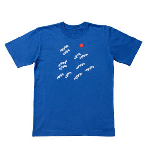
Koinobori 2006
Katsunori Aoki

In the front, a boy with a koinobori (carp streamer) on his head, and on the back, the logo “Japan”.
Both are stamp pressed with silver on this “Koinobori 2006”.Aoki pursued a long-time icon like Mount Fuji that can be applied to the world today, and found the koinobori motif.The illustration is “Japan” in itself.
Aoki hopes families will wear it, the father, mother, and the children side by side; just like in the song “Koinobori”.
The font used for the logo on the back is an original font by Aoki, “afloat”.
stitched
Jun Aoki

Aoki entered the T-1 WORLD CUP from the field of architecture.A thread-like print is featured from the left shoulder towards the back on the white body of the shirt.The pink thread print embossed with ink, just like a real embroidery, stands out on the white canvas.
Aoki commented on his t-shirt: “This shirt looks like a simple white shirt, or a t-shirt badly sewn with colored thread, or a shirt sewn by a living thread just the way the thread wants to.”
MounT.FUJI
Gugi Akiyama

What’s something that everybody loves in Japan?
What do Japanese people love?
What do non-Japanese people love?
Akiyama’s answer to this was, what else but Mount Fuji! He wants you to wear it and take a picture with Mount Fuji.
He wants you to wear it and climb Mount Fuji.But actually, he thinks it looks cool worn on the streets.Some tips from Akiyama on how to wear this t-shirt:“Wear it when your face is red being angry or drunk, and you’ll look like an erupting volcano!”
LION HA-NETEIRU
Tsuguya Inoue

Inspired by a lion he saw in an Iranian carpet, Inoue decided to design a “genki” (cheerful and energetic) and happy t-shirt.A lion bit by a snake jumps (HANETEIRU) in his t-shirt.His design reveals a different aspect of Inoue’s world from his well known commercial works, such as the advertisement for Comme des Garcon.The music he thinks would best fit his design is “THE LION SLEEPS TONIGHT” by THE TOKENS.“THE LION SLEEPS TONIGHT” in Japanese is “LION WA NETEIRU”.
“LION WA NETEIRU”, “LION HA-NETEIRU”… a pun??
AISHITAI NIHON
Ayumi Ohashi
Japan’s ocean waves, the sun, and Mount Fuji are Ohashi’s motifs for this design.The base color of the shirt is Japan blue, the color of the national soccer team uniform.Her warm illustration will surely be adored by a wide range of people, just like last time.
The title of the t-shirt is “AISHITAI NIHON” (to love Japan).She hopes that people will think about being proud of Japan.
JPNAA
Kashiwa Sato

A matte silver logo of “JPNAA” shines on the base color of soft pink, the color of the cherry blossom.On the back is the logo of “ANPJA”.These two logos stand for “JAPAN”.
Kashiwa thought it was appealing to design the logo simple as “JAPAN”, but then again he thought it may be a bit difficult to wear such design in Japan.“JPN” would be am abbreviation too boring, so he symbolized the name of the country by recombining the spelling, to “JPNAA” and “ANPJA”.The silver ink used for the logo is aluminum blended with rubber ink, and has a more rough texture than the silver used for Katsunori Aoki’s t-shirt.
104.5 degrees
Taku Satoh

In last year’s T-1, Taku presented us with two designs.On one t-shirt, he took a pen and colored the t-shirt with his right hand.
On the other t-shirt, he took a duct tape and taped the t-shirt with his left hand.
This year he came up with something completely different.A simple logo on a fresh mint green canvas.
The logo is a quiz. “104.5 degrees”. Taku points out that nothing on earth can exist without something that exists in this angle.
The tag of the t-shirt reads “an important angle for us”.Can you solve this quiz?
sleeping fish
Shin Sobue

The tightly woven curves drawn is the image of the water pattern of the pool.Two goldfish silently sleeps tight in the right chest.His design is thought out into detail, as his design always is.The goldfish is printed with a combination of blue, pink, and yellow, and the layout of this complicated multi-color print has been closely examined by Sobue.
Sobue’s image of his design is this: “The water pattern of the pool is exaggerated Hockney, the goldfish with realistic scales with a silhouette like Mathis”Hockney is an artist famous for his artwork of pools, and Mathis is a famous artist of the 20th century who was crowned the title of “King of the Fauves”.
Bara Iro
Naoto Fukasawa

The red and white coloring of the shirt is the represents the national flag of Japan.The rose, is a frequently used pattern for flower prints on apparel.
Fukasawa’s design combines these two motifs with the soccer ball.Japan, roses, and soccer ball.Merging these three motifs that may look irrelevant at first, Fukasawa created a t-shirt that well answers the T-1 WORLD CUP concept!This is definitely a work of one of the best product designers in the world.Check out the vividness and the gradation of the final color of the rose.It went under numerous trial and error of the print process.
WHERE IS YOUR COUNTRY?
Michihiko Yanai
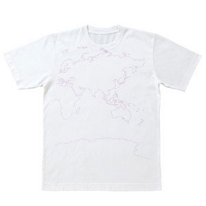
Yanai initially designed “JAPAN” in red on the front, and “NIPPON” on the back, and the national flag on the sleeve.
But at the last moment, he “suddenly wanted to create a t-shirt that can empower communication”.
The person wearing this t-shirt will point at his/her country, and the people around him/her will start pointing the t-shirt to show their homeland too.
This t-shirt is a tool for communication.And the world atlas is printed with “glow-in-the-dark ink”.The ink charges the light, and glows in the dark.A fun t-shirt to wear, day or night!
We’ve introduced the essences of the 24 t-shirts, but each t-shirt has such a story behind it, there’s always much more to talk about.
It’s a t-shirt you’ll want to tell the people around you the stories and idea behind it.
And in these 24 contestants lies the future world champion.
Which t-shirt will you vote for?
The battle has just begun!
2006/6/13
T-1 has been receiving media coverage, especially from magazines.
Here are 3 magazines you can find in stores now with pages on T-1.
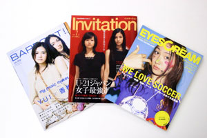

*”Barfout” will be in stores on June 17th (Sat).
From right:
“EYESCREAM” July issue (p.93/out June 1st)
“Invitation” July issue (p.120-121/out June 10th)
“BARFOUT!” July issue (p.147/out June 17th)
Among these magazines, “Invitation” is featuring T-1 in a two-page spread!

The 24 t-shirts are all lined up with comments on each designer.
With all the contestant designs aligned, they look like the members of the match entering the coliseum!
Be sure to check these magazines out when you see them in stores!
An article on T-1 was also published in the Nikkan Sports newspaper on May 30th.
T-1 was covered in about a third of page 22, and was one of the first articles on T-1 WORLD CUP.
Has anyone seen this article?
A few of the t-shirt designs were revealed, although the article was published before the grand opening.
Hmm…
More and more of T-1 will be appearing in public.
We’ll let you know in this page!
_EYESCREAM
http://www.usen-magazine.jp/es/
_BARFOUT!
http://www.so-net.ne.jp/barfout/
2006/6/13

Have you checked out the 24 t-shirts in the competition already?
Each t-shirt has a name, and ideas are expressed in their designs.
In this busy world today, I guess you may be too busy to read the individual artists’ pages…
But no worries. We put to gether a summary of the highlights for you!
Today’ we’ll introduce the 14 designs done by the contestants from overseas.
If you want to read more about the individual artists, just click the “Artist” tab on the menu bar, and the pages are waiting for you…
Peace from New York
Stefan Sagmeister
USA

Do you recognize the wrinkled way “NEW YORK CITY” is designed on this t-shirt?
This logo is from a portrait of John Lenon taken by Bob Gruen, a famous photographer. These letters are cut out just the way it was printed on this portrait, and printed on this t-shirt.
And look, on the tag of the t-shirt, you can see the original photo of John!
Be Great
Kam Tang
UK

This bright red illustration expresses Kam’s thoughts on how soccer should be played, and how t-shirts should be worn.
Hmmm…. something the two have in common…
Happy, energetic, and dynamic, maybe?
By the way, have you noticed that the title “Be Great” is a play on words of “Great Britain”?
usagi desu. yoroshiku.
Tom Vincent
UK
When you walk down the valley near Tom’s family home in England early in the morning, the fields are full of rabbits playing in the fields.
After a few hours, the rabbits all dissapear like magic, and only a ram is left.
Tom expresses that countryside scene in his colors and illustration.
Want to know more about the adventures of the rabbit?
Check this page out!
http://tworlds.worldpress.com/
Tea-shirt
Klein Dytham architecture
UK/Italy
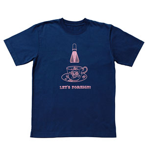
This “Tea-shirt” is a collaboration of a tea cup and a tea stirrer, an equipment used for Japanese tea ceremony!
A blend of European and Japanese culture, something only a non-Japanese architect unit based in Japan can do.
“Let’s Foreign” on the front and “Gaijin Joto!!!” on the back is a global message from KDa, encouraging you to jump out into a world where you can become a Gaijin(foreigner)!
Das Fussballfeld
Erik Spiekermann
Germany

“Das Fussballfeld” means “Soccer Field” in German.
Erik, a designer from the host country of this year’s FIFA World Cup, designed a soccer field with the elements of the fields and its measurements.
The disciplined characteristic of German football is also expressed through the design of the rules and measures.
In spite of the often conveyd dynamic image of sports, of people kicking, jumping and celebrating goals, Erik’s aim was to merge another aspect of the game with this design; that all sports has a system of rules and measurements.
Blue Baby
Hamansutra
Germany/Iran
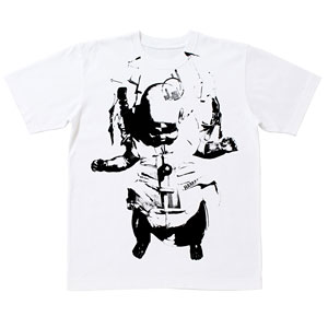
Hamansutra is the only fashion designer among the contestants.
A crashed dummy baby (the ones used for motor accident simulations) is printed all over on this shirt.
The design may look fashinable at fist sight, but this image is an image of “new babies for the world”.
What message do you think it conveys?
Chopin funclub
Kinga
Poland
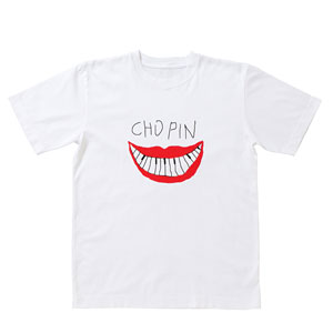
A cheerful and happy illustration expresses her respect towards Frederic Chopin, a famous composer from her homeland, Poland.
Chopin was an artist who was always inspired by the Polish folk arts.
Her message through this shirt is this: In this world today where national identities dissapear, examples like Chopin is necessary than ever!
Another message: Don’t forget to wear this t-shirt when you visit Poland.
T(ypography)-shirt
Oded Ezer
Israel
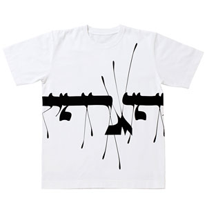
Oded is a famous typography artist in Israel
This design may look like an illustration or a pattern, but it actually is “Typography” written in Hebrew.
Oded wanted to create an exciting design, and yes, he was succesful!
Intersteller Greeting Card
Silas Hickey
Australia
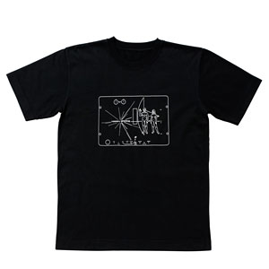
This design, titled “greeting card between the stars”, was inspired by the Pioneer 10 and 11 space probe plaques, which was launched to outer space in 1972.
The word “HAPPY ENDING” lies in the center of tha plaque, which illustrates a man and a woman and other symbols to explain where the spacecraft comes from.
This t-shirt also shows where Silas represents: “Australia is VERY MULTICULTURAL so in terms of this diverse ethnicity it can also represent PLANET EARTH”
Ventriloquist of Eleven
Nando Costa
Brazil

Soccor is the motif of Nando’s design, thought it may not look so at first sight.
His design was inspired by the coach as a ventriloquist controlling the whole team.
The role of the coach, the art of the ventriloquist.
Fighting Club
Poledesign
China

Chi Chen says that life in Shanghai is so competitive and busy, it’s like you’re in a soccer field.
This t-shirt “Fighting Club” is the image of Shanghai, where you have to compete with yourself or with your counterworkers.
The ink on the outline of the Chinese character and the clouds is thicker than the other parts.
It’s a t-shirt that both looks and feels three-dimentional!
Ma Eum
Mimi Son
Korea
“Ma Eum” means “the mind” in Korean.
This word written in Korean alphabet is embedded in the illustration of a plant.
Mimi made this word bloom in her image of flowers.
With this tender image on this shirt, she hopes to communicate with many people.
Kickheads
Phunk studio
Singapore

When the designer of Phunk studio was a kid, there was a sign that said “no football allowed” where he used to play.
That sign never stopped him and his friends from playing soccer there.
Soccor is a game that anyone can play, regardless of race, age, or social status
They put this idea into their pattern of figures kicking the ball.
The backprint of this shirt is the same design on the front, the colors reversed.
The Configurable T-shirt
Usman Haque
PLANET EARTH
The hexagon shaped pixels printed with foam ink on this shirt are for you to color, to create a design of your own.
So now you know why the t-shirt is named “The Configurable T-shirt”.
Here’s where you can try “configuring” your design on this t-shirt.
http://www.haque.co.uk/tshirt
Now that you know the ideas and stores behind the designs, doesn’t each t-shirt glow in a different way?
Tomorrow we’ll be introducing the rest of the designers and their t-shirts, the 10 contestants representing Japan!
…to be continued!
2006/6/13
« Previous Page — « Next Page
|