|

Many of the 24 contestants of this year’s T-1 WORLD CUP are involved in projects throughout the world, and Klein Dytham architecture (KDa) is no exception.
KDa is an architect unit based in Japan, who works on projects around the world.
Just like the logo on their design “Let’s Foreign!”, Mark Dytham from UK and Astrid Klein from Italy spends busy days running around foreign countries of the world.
On one sunny day in June, we heard a note that both Astrid and Mark are in their Tokyo office.
The staffs at the T-1 WORLD CUP office made a quick stop to meet them and hand them the final t-shirt sample!
Examining the actual t-shirt in detail, Mark comments “Isn’t the print a bit small?” and Astrid answers “Really? I think it looks cute”. We got a glimpse of how they work together, exchanging their thoughts and opinion.
The air that they create was so charming that we couldn’t resist taking pictures!

The “Tea-shirt” looks really good on their smiley faces!
Read more details on their design here!
2006/6/15

Hi all!
A week is about to pass since the opening of the 2nd T-1 WORLD CUP.
We’re receiving loads of e-mail every day!
Today we’ll give you a glimpse of what people thought of the t-shirts!
Just to refresh your memory, here are the questions we asked:
Which t-shirt would you like to buy/have already bought?
Which t-shirt do you think will win?
We were just amazed at how different everyone’s opinions were.
For those of you who still haven’t decided on your vote, this may be something to
read to help you make up your mind.
Here we go!
Shopping is always about instinct. T-shirts are no exclusion.
So here are some voices from the readers who decided which t-shirt to buy by
“instinct”.

JPNAA
Kashiwa Sato

Love at first sight.
It looks cool!
The color of the shirt, the color of the logo, and the design on the back, everything is great.
If I would express it in English, I guess it would be “It’s so cool!”
sleeping fish
Shin Sobue

I didn’t buy last year’s Akahara-T.
I wasn’t sure if I could wear it well. This one, I think I can wear.
The t-shirt for this year again looks cool, especially the way the lines are drawn.
T(ypography)-shirt
Oded Ezer
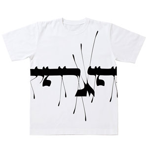
At first it just sort of drew my attention, but when I saw the design on the back,it really started to attract me.
I like t-shirts with prints on the back, so this t-shirt is really my type.
I am drawn to the print on the back more than the one on the front.
This t-shirt is “cool” too.
I’ve realized that what matters to me when I choose t-shirts is whether they look “cool” to me or not.
(Kiyo)
sleeping fish
Shin Sobue
KickHeads
Phunk studio

I want to buy them because I simply like them.
I think it will look good worn layered with other clothes.
I’ll ponder a bit more before I decide.
Ma Eum
Mimi Son
I think this shirt will be the winner, because it looks easy to wear, and the way the Korean alphabet is in the design is cute.
(Tko)
T(ypography)-shirt!
Oded Ezer
I was looking for a black and white t-shirt.
When I read the details of this design…. boom!
The front print and the back print became one, and it the design suddenly increasedits depth.
The front and back designs aren’t actually connected, but it looks like one design.
This design has something in common with the Red and White Plum Blossoms Screens or the Iris Screens of Korin Ogata.
Aishitai Nihon
Ayumi Ohashi
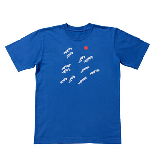
I picture myself remembering “I bought this t-shirt in the T-1 WORLD cup, during the 2006 World Cup in Germany. The match between this team and that team was such a game.”
It’s the year of the World Cup as well as the season for T-1 WORLD CUP.
The color of Japan Blue and her illustrations of the rising sun, and Mount Fuji touched my heart.
JPNAA
Kashiwa Sato
Simple, but to the point.
I like the way he’s World Cup conscious and put JAPAN in the t-shirt, and how the color fits both men and women.
I like the way the logo is bold and strong too!
Samurai, is the word!
And the logo is different on the front and on the back!
Nothing more to say!
(Mee)
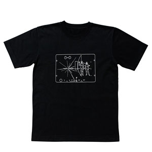
104.5 degrees
Taku Satoh

JPNAA
Kashiwa Sato
I looked at the 24 t-shirts, and clicked the one that I liked most, and it was Taku Satoh’s design!I bought his t-shirt last year!
Then I clicked the one I like next.Kashiwa Sato.
I bought his t-shirt last year!
How funny and strange.
Design is a type of language I guess.
(Miu)
Blue Baby
Hamansutra
T(ypography)-shirt!
Oded Ezer
They both touch my heart.
Humor, cuteness, and grace.
I can see the designers enjoying their creation.
I feel like I can be friends with them.
Bara Iro
Naoto Fukasawa

WHERE IS YOUR COUNTRY?
Michihiko Yanai
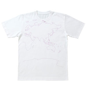
Simple white t-shirt that’s easy to wear is an advantage.
It stands out, but not too much.
(Subtleness is the intention)
A unisex t-shirt? I guess?
Makes both boys and girls happy! maybe?
(Nemuzo)
MounT. FUJI
Gugi Akiyama

It stood out from the others, just like Mount Fuji!
WHERE IS YOUR COUNTRY?
Michihiko Yanai
Simple and global.
Good to wear solo, or under other clothes.
Looks like it’ll be easy to wear.
JPNAA
Kashiwa Sato
I liked both of his t-shirts last year, and I regret not buying them.
I couldn’t wait to see Kashiwa’s design this year.
I really like the cuteness within this simple and stylish t-shirt.
You can’t find a soft pink t-shirt with only a simple logo like this one. Usually they come sweet and lovely.
I really like the combination of pink and the “JPNAA” logo.
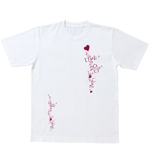
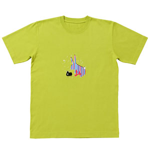
Tea-shirt
Klein Dytham architecture
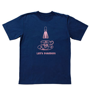
I like the simplicity and the elegance in this t-shirt, the way the illustration is drawn with lines, the combination of pink and navy, and the balance of the amount
of these two colors.
Plus I collect tea cup patterns.
Bara Iro
Naoto Fukasawa
The way that it looks like a soccer ball but really is a pattern of roses is really nice.
I think it will remind you of this year’s World Cup when you wear this in the future.
A lot of people may choose this as their favorite, but I am guessing that many people will order this as an extra t-shirt to remind them of this year’s World Cup.
(Anonymous)
Interstellar Greeting Card
Silas Hickey
The concept is so intelligent!
Hello universe!
T(ypography)-shirt!
Oded Ezer
Strong impression, but yet stylish.
sleeping fish
Shin Sobue
No words to express his design work.
The Configurable T-shirt
Usman Haque
I think his concept of designing your own t-shirt will attract the readers of Hobonichi(Hobo Nikkan Itoi Shinbun).
usagi desu. yoroshiku.
Tom Vincent
This is the t-shirt I first clicked when I saw the thumbnails of the shirts.
The point is that this was the first t-shirt I checked in detail, and voila!
It wasTom’s design.I think he will make it again this year.
I think the design is more fashionable than last year.
I think it looks cool. I like it.I want to wear it, I want to buy it.
It’s just so to the point. It’s the work of last year’s champion.
Vincent! My best wishes for the 2nd time champion!
(Kouketsushigeo)
Ok, more mail coming along.
Here are some mails from the “t-shit theorists”, who logically explained their reasons of purchase and the grounds for predicting the champion.
Ma Eum
Mimi Son
T(ypography)-shirt
Oded Ezer
T-shirts with only letters on it draws my interest, like the “+LOVET”.
The fonts, typography, are so interesting.
Mimi Son and Oded Ezer’s designs were so attractive, I went to check their design in detail, and ended up viewing their official websites.
They are so artistic using Korean alphabet and Hebrew, although both are a pretty minor language.
I wonder if this design is possible with because their language and alphabet is systematic.
How would it be with Hiragana or Kanji?
(Anonymous)
Bara Iro
Naoto Fukasawa
This design shocked me when I saw it, and I ordered it.
I’m not sure of the reason why I like this t-shirt.
I think Bara Iro instantly conveys a message, more than what meets the eye.
WHERE IS MY COUNTRY?
Michihiko Yanai
I think this t-shirt has the power to spread as a tool to empower communication and a feeling of unity in situations like the soccer World Cup.
The concept is clear and easy to understand.
Bara Iro
Naoto Fukasawa
The red rose on white is simply beautiful.
Maybe there are many rose designs for women, but this rose-pattern is a rare design that men can wear on a daily basis.
Lion Ha-Neteiru
Tsuguya Inoue

I think a lot of people will like this happy image.
(keroyon)
Last but not least, is the “Emphasis on Concept” type of people.
Here are the messages from people who agree on the message from the designer, the concept, or their design.
WHERE IS YOUR COUNTRY?
Michihiko Yanai
I’ve been inspired by Yanai’s work, but this concept just knocked me out.
If I wear this to a bar, I’ll be the center of attention.
And I’ll proudly point to Japan and say “I’m here from JAPAN!”
Even after the World Cups is over, never forget to bring it when traveling overseas!
Never forget it!
(kayo-san)
sleeping fish
Shin Sobue
The Configurable T-shirt
Usman Haque
When ordering Sobue’s goldfish t-shirt, the design in the lower right caught my eye.
I read the description of the design.
Color it with a permanent pen!?
I thought for 30 minutes, and ended up ordering both.
(Yaki)
Peace from New York
Stefan Sagmeister

John Lenon on the tag just got me.
After LOVE comes PEACE!
I hope a lot of people wear it believing that “we can change the world”.
I’m buying this.
WHERE IS YOUR COUNTRY?
Michihiko Yanai
My colleague from the United States is getting married in August. She’s marrying an Australian.
The two met in Japan, and so they’re getting married in Hawaii, a middle point of USA (the continent), Australia, and Japan.
I was looking for a gift for them. When I saw this t-shirt, it came to me. This isit!
I’m buying one for her, and one for him.
(Michelle)
104.5 degrees
Taku Satoh
I solved the quiz, and now I know what this important angle means.
The earth, nor us, would have existed without this angle.
The truth in what the world consists of, is strikingly simple, and beautiful. Just like math.
The simple answer that lies in our hands evolved, multiplied, interlocked, and vibrated into its stable state. The earth.
Oh, and by the way, I’m a big fan of Taku.
Bara Iro
Naoto Fukasawa
I like roses.
A combination of fragrant blossoms of roses, and a sweaty soccer ball.
It gives me an image of a cool but rebellious person.
T(ypography)-shirt!
Oded Ezer
I like typography.
I like the thought that letters can evolve into artistic graphic.
I like the dynamic moves of the lines.
(Maimai)
Everyone is looking at the same t-shirts, but in a totally different way.
Each reason for their choice is unlike any other.
And those of you who are still making up your mind, we hope this page helped you with your decision.
Here are some other e-mails we’ve received.
This isn’t a question about T-1, but when do people start wearing t-shirts?
Lately I see more and more people wearing t-shirts.
I wonder if there’s a certain day people decide to start wearing t-shirts.
I always miss the timing, and the next thing I know, autumn is here.
Can someone give me some advice?
(Misasa)
I remember last year’s T-1 WORLD CUP took place in fall.
The special packaged t-shirt was delivered around December.
I wonder when everyone opened their package?
Just some thoughts I’ve been pondering…
We are still waiting to hear from you!
Please tell us
the title of the t-shirt you would like to buy, or already bought
the title of the t-shirt you think will win
along with the reasons why, and e-mail us.
mail@t-1.cc
We are always waiting for your comments, from people who ended up changing their minds after reading the details of the designs, or from people overseas…
The more e-mail, the better!
See you next time!
2006/6/15
We made three types of banners for you this year.
They all look great, take your time choosing which one you want to use!
When you’ve decided, go ahead and download them to put on your website or blogs!
Please link these banners to: www.t-1.cc
Official Banner
This is the man banner for the 2nd T-1 WORLD CUP.

Banners Featuring the Contestant Designers
24 banners for the 24 contestant designers!
Who’s your favorite? Who will you root for?
| Ayumi Ohashi |
Erik Spiekermann |
 |
 |
| Gugi Akiyama |
Hamansutra |
 |
 |
| Jun Aoki |
Kam Tang |
 |
 |
| Kashiwa Sato |
Katsunori Aoki |
 |
 |
| Kinga |
Klein Dytham architecture |
 |
 |
| Michihiko Yanai |
Mimi Son |
 |
 |
| Nando Costa |
Naoto Fukasawa |
 |
 |
| Oded Ezer |
Phunk studio |
 |
 |
| Poledesign |
Shin Sobue |
 |
 |
| Silas Hickey |
Stefan Sagmeister |
 |
 |
| Taku Satoh |
Tom Vincent |
 |
 |
| Tsuguya Inoue |
Usman Haque |
 |
 |
Flash Animation Banner
This flash animation banner automatically updates the newest information of the 2nd T-1 WORLD CUP.
Please read the following notes on usage on settings for this banner.
Continue reading Promote T-1 on Your Website!…
2006/6/14
« Previous Page — « Next Page
|